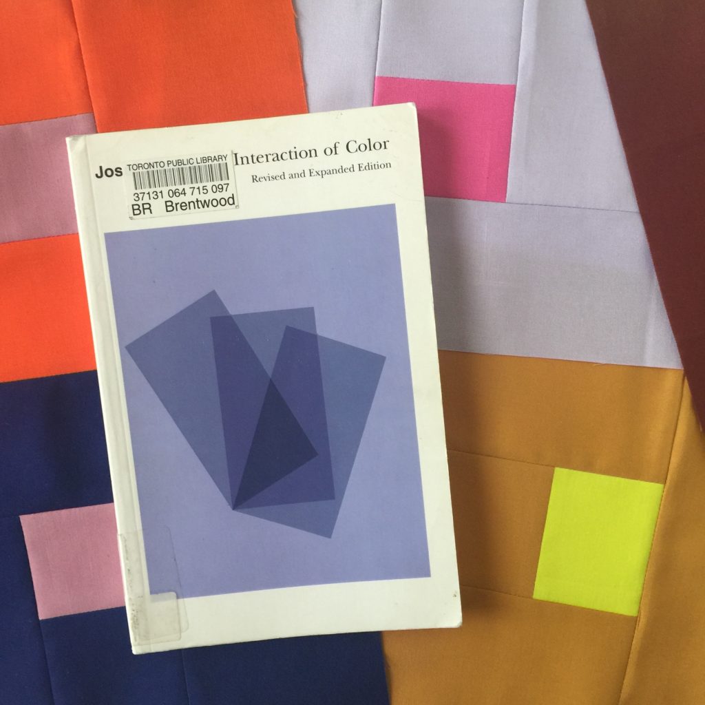
I spent my sewing time this weekend doing some exercises from Josef Albers’ Interaction of Color. There is something very relaxing about playing around with color for its own sake without worrying about how it might feed into a specific pattern or creating some larger finished project. … though of course, in the end the exercises sparked tons of other ideas.

I wanted to sew but I didn’t want to fuss over print combos and lots of different measurements. I like the idea of improvising but don’t 100% love the results I seem to get with improv blocks. I wanted to open up some space in my brain but I didn’t really want to think too hard. These exercises (executed in fabric instead of paper) were just the thing.
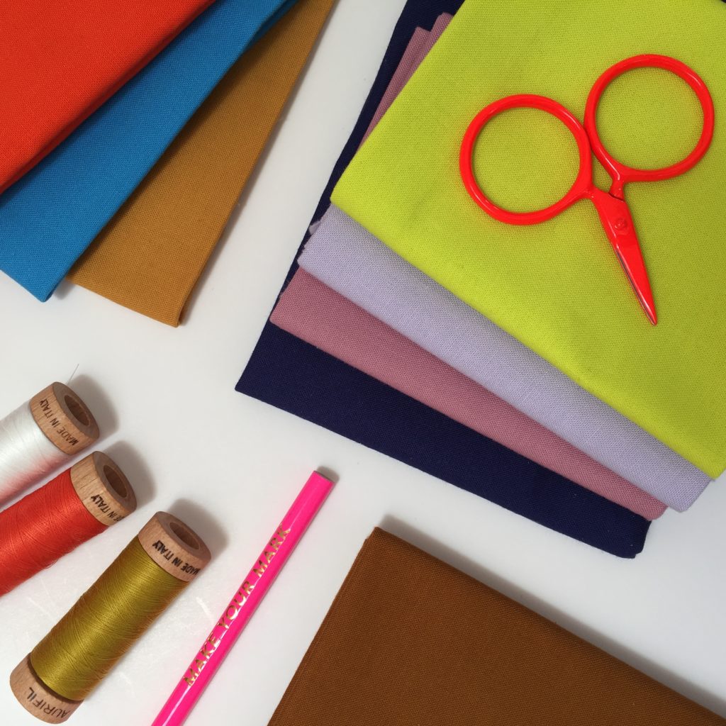
And you know that weird pile of random solids you have? The one about which you sometimes wonder, why did I buy these colors, and will I ever use them? This is a perfect way to use them up.
I wrote up some instructions for the simple block that I made based on Chapter 4, which is all about experimenting with how colors influence one another. If you try the exercise, let me know how it goes!
Josef Albers Interaction quilt block tutorial
The Interaction block is based on the work of Josef Albers … specifically exercise IV in his influential work Interaction of Color.
Before Albers, much of color theory was all about the science of it. … optics and color wheels and all the different ways of modeling the spectrum – all of the ideas we learned in school. Albers encourages us to think of color a little bit differently. He was interested in how colors influence each other and how we perceive color in these context of these relationships. He wants us to experience and observe. My hope is that this exercise will unlock some creative space in your brain and spark some new directions for your quilting.
One color as two
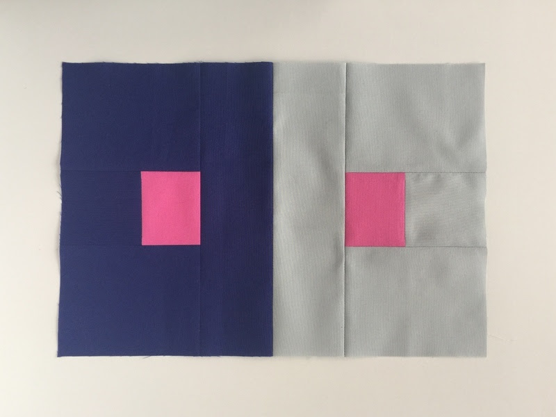
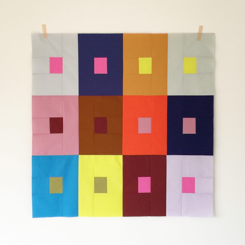
The goal of exercise IV is “to make one and the same color look different” by positioning small rectangles of paper on larger fields. We’re quilters so of course we will be doing this with fabric! You’ll choose a single color for the center rectangles, then juxtapose it against two different colors, observing whether certain colors are more prone to being influenced by its surroundings, or conversely, which colors tend exert influence over others. In both scenarios what we’re looking for are cases where a center rectangles appears different from its twin.
Some juxtapositions will be more successful than others. For example, to my eye, there is a distinct difference in shade between the two green centers placed on the yellow (appears darker) vs. the blue field (appears lighter).

In the following example, however, the pink centers appear to be much the same. It’s all about trial and error!

Fabric
Gather up all the small pieces (ranging in size from 5 x 3″ to fat quarter size) of solid fabric you can find. All of it! We’re not necessarily going for good matches here, so the more random the better. As Albersputs it “whether or not we arrive at a pleasant or harmonious color combination is unimportant.”
For one block you need three colors: a single color for the center rectangles, and two different colors for the background field.
Cut
For one side of one block, cut the following pieces:
Color A
- one 2.5″ x 3″ center
Color B
- one 3″ x 3″
- one 10″ x 3″
- two 4″ x 5″
Repeat for the second side of the block, using the same color for the 2.5″ x 3″ center, and a different color for the rest.
Sew
- Sew with a 1/4″ seam. Press all seams open.
- Sew the pieces of one side of the block together from the center outward, as in the following photo:
- Repeat for the other side of the block.
- Pin the two sides of the block right sides together along the 10″ pieces, flipping the top piece back to make sure the center rectangles are lined up.
- Sew together.

What next?
So what should you do with your blocks when the exercise is done? I made enough for a wall hanging (or stroller blanket ,,, even a small baby quilt if you add some borders).
References
Albers, Josef. Interaction of Color. New Haven: Yale University Press, 1975.
Share
Let’s see those blocks! It would be great to compare notes, so please share on Instagram with the hashtag:
#interactionblock


