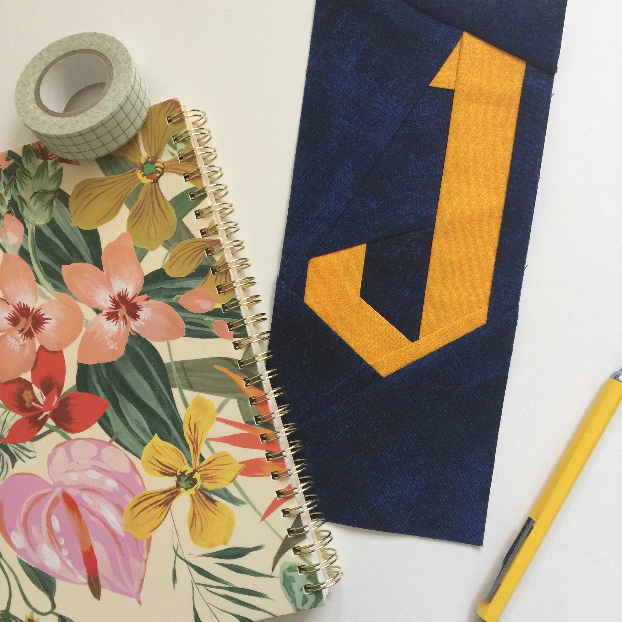
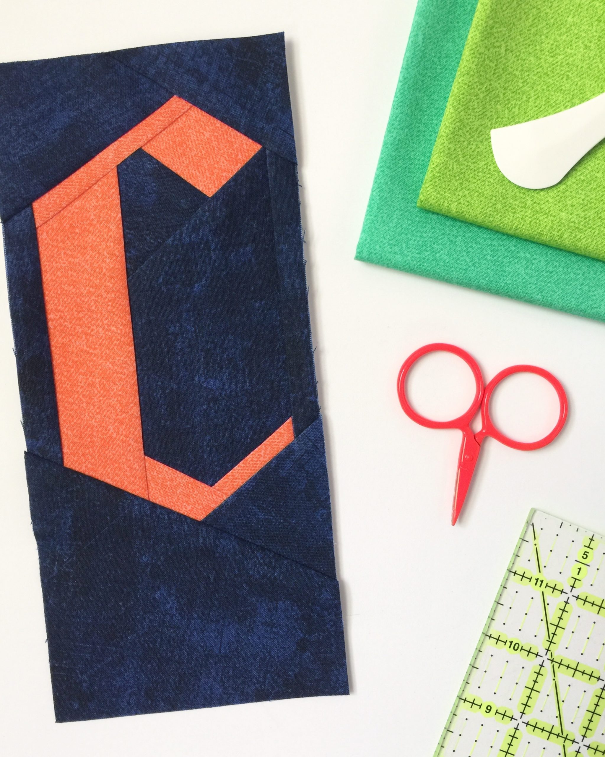
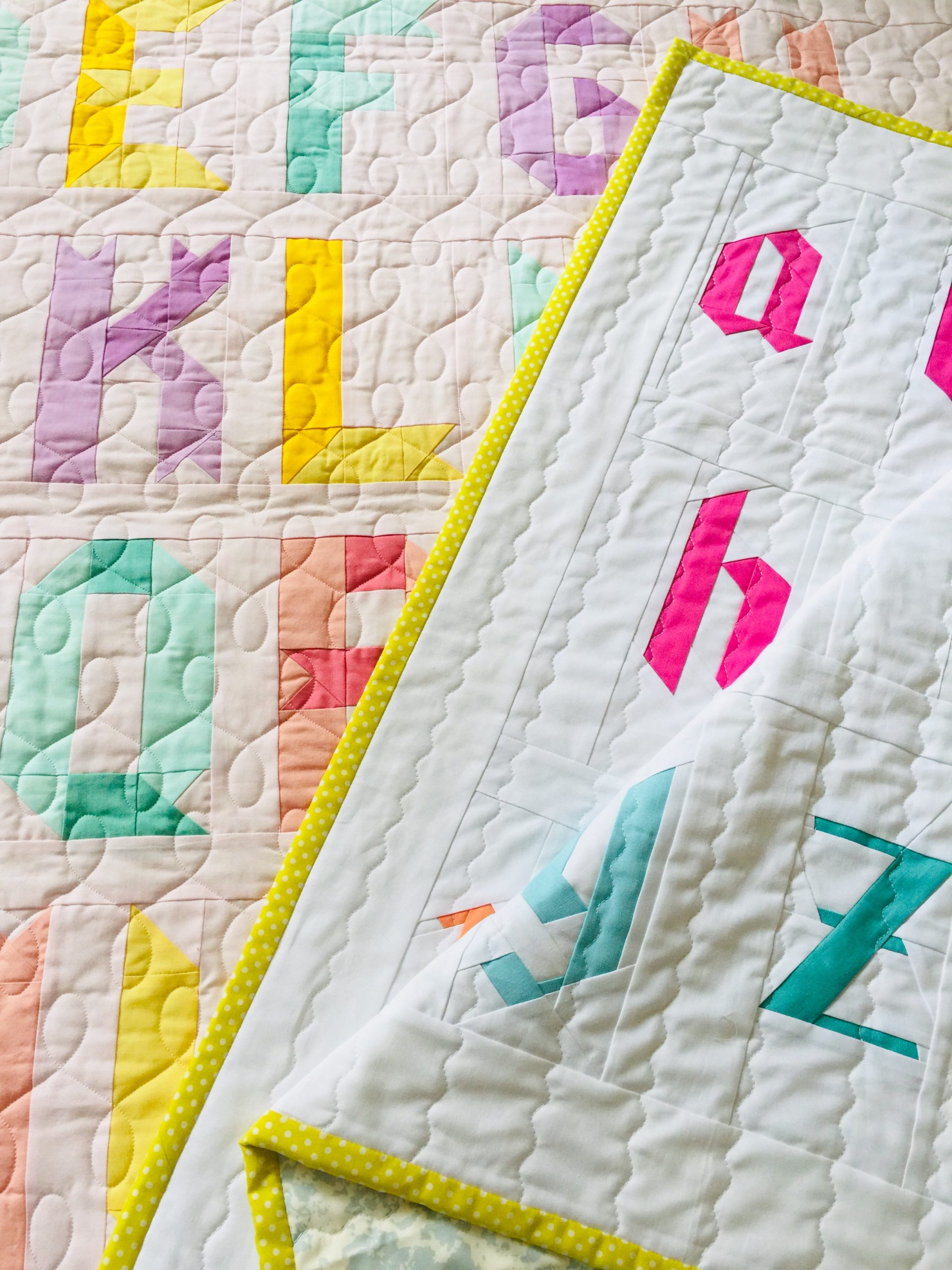
Some progress on the Uppercase version of the Blackletter pattern to share. I’ve been working on this set to complement the lowercase alphabet pattern, and while it’s definitely still a work in progress, it’s coming along more quickly than the first one.
Update: the pattern set is here!
I’m making the test/cover version using Libs Elliott’s phosphor fabrics on a dark background (kind of the polar opposite of what I used for the lowercase, which was a lot softer and sherbet-y). There is something really special about these fabrics – they’re not exactly neon but they almost seem to glow from within.
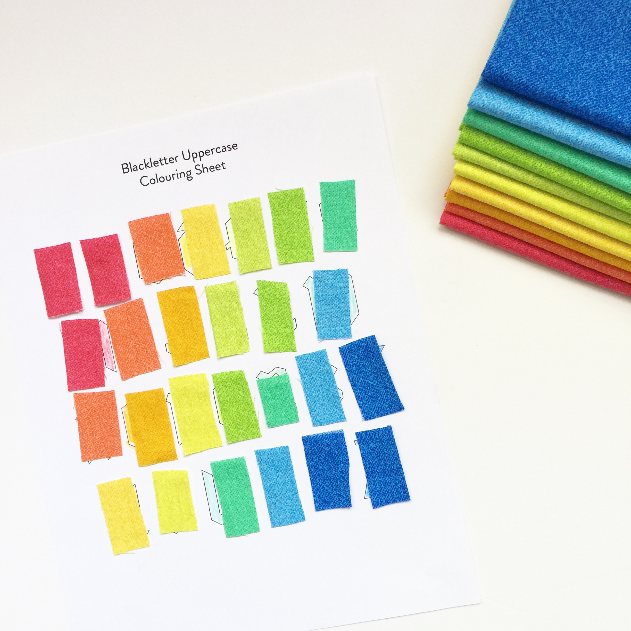
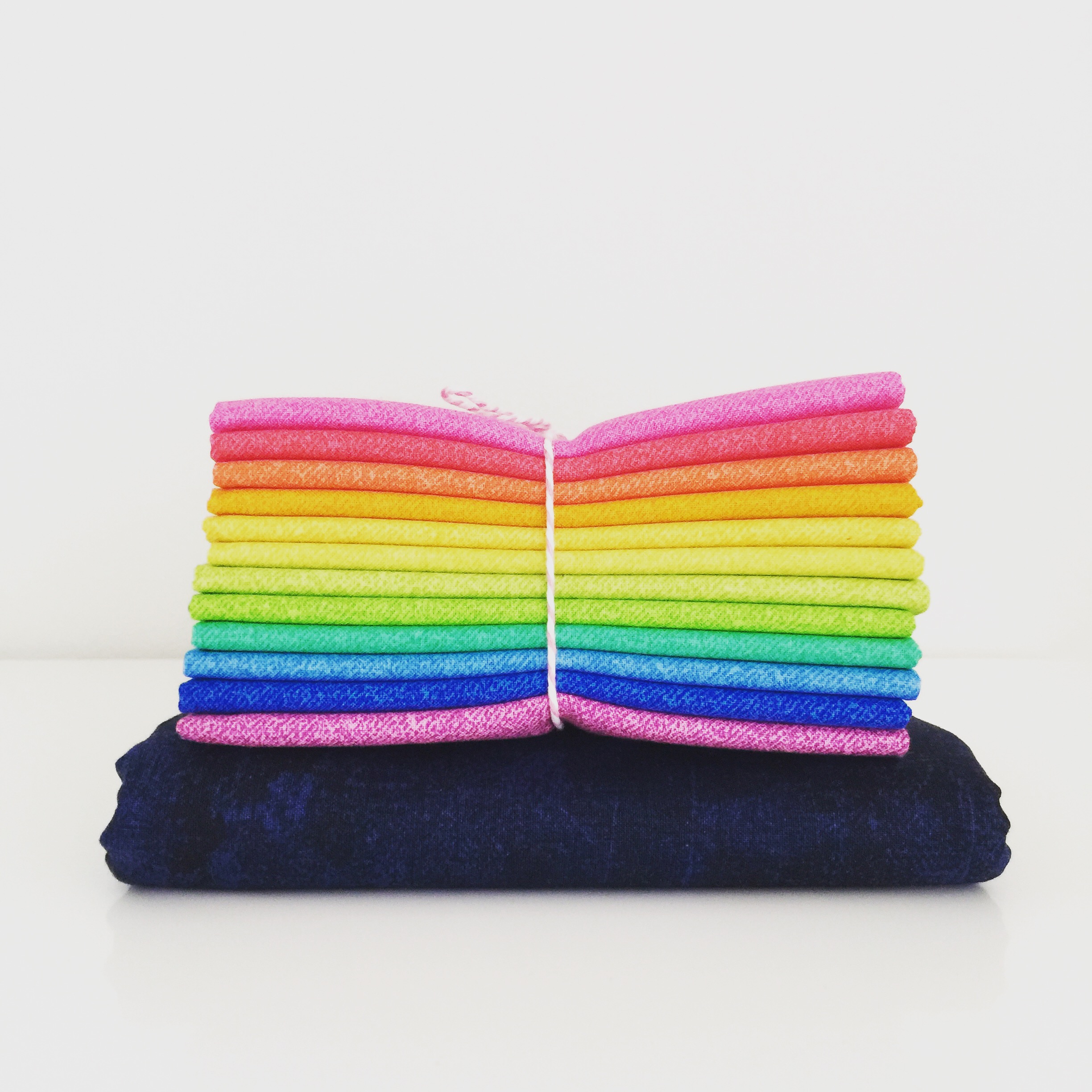 On my pattern colouring sheet you can see that I chose to go with a subset of the colours available in the fat quarter bundle. Essentially removing the pink and purple (which are quite lovely on their own) to get a more primary-ish, very 80s-style rainbow.
 And here are a couple of test letters. (You can see the rest over on my Instagram.)

