Have you ever wanted to make an alphabet quilt? This week I’m starting a new series here on the blog where I’ll take you through the whole process, step by step. I thought I’d start off with some frequently asked questions. Choosing the right pattern and fabrics are probably the most important steps, so hopefully this will help you out!
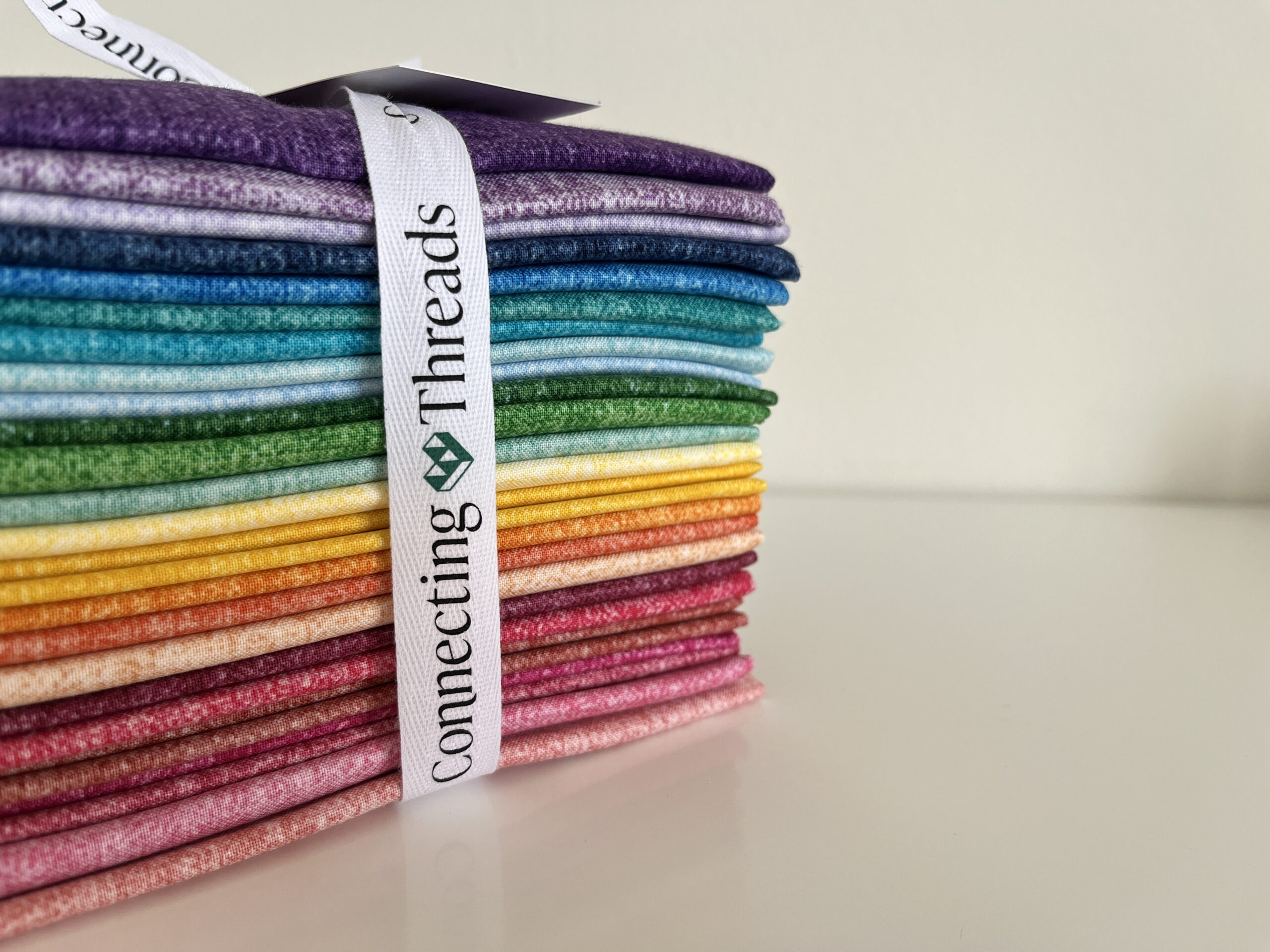
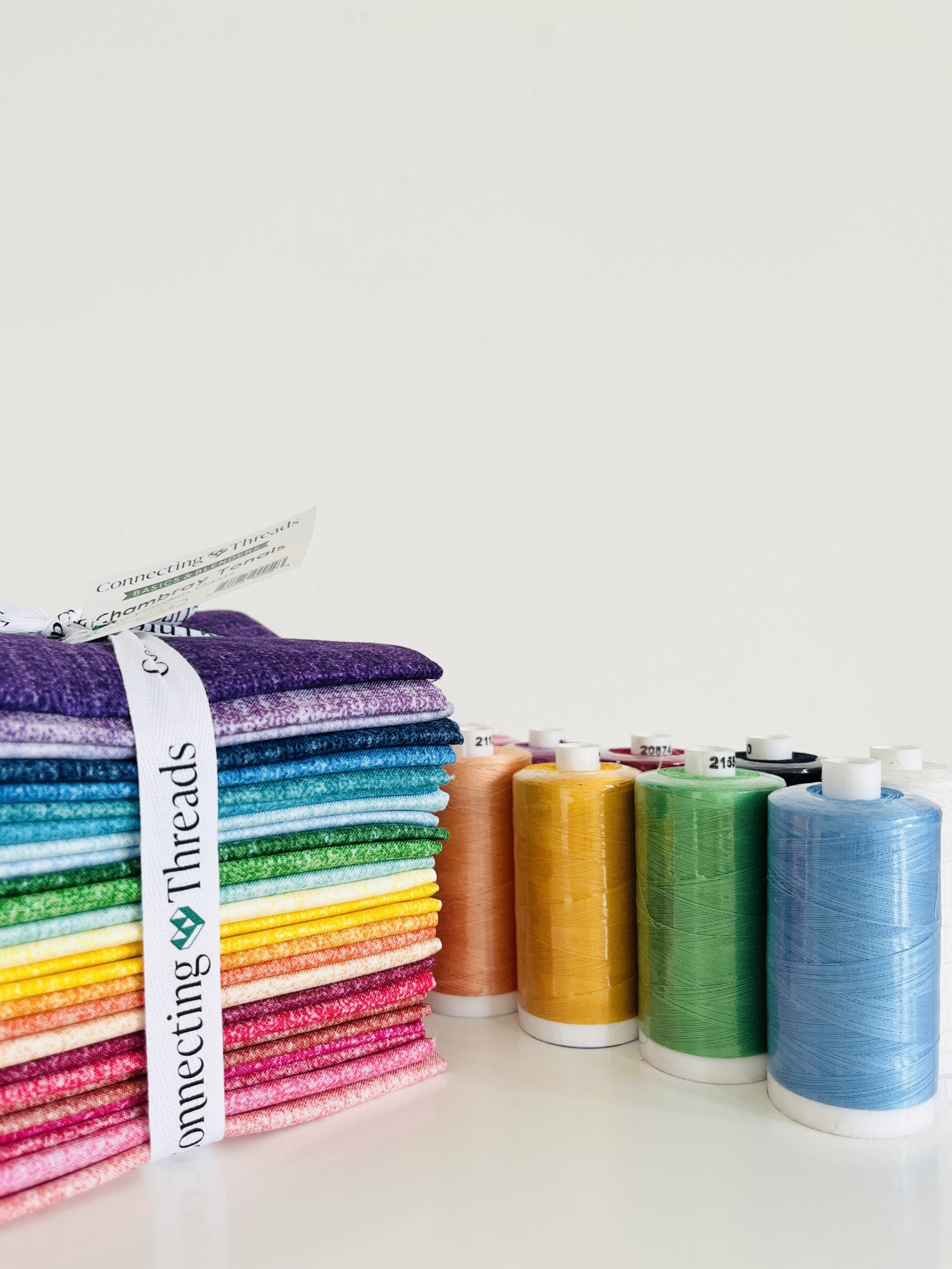
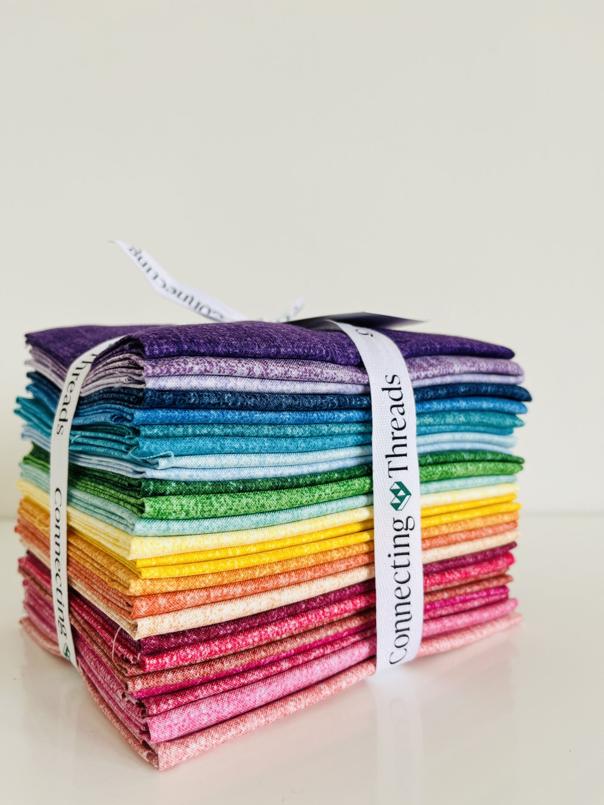
I’ve already chosen my pattern (Ribbon Letters) and my fabrics will come from this incredible bundle courtesy of Connecting Threads.
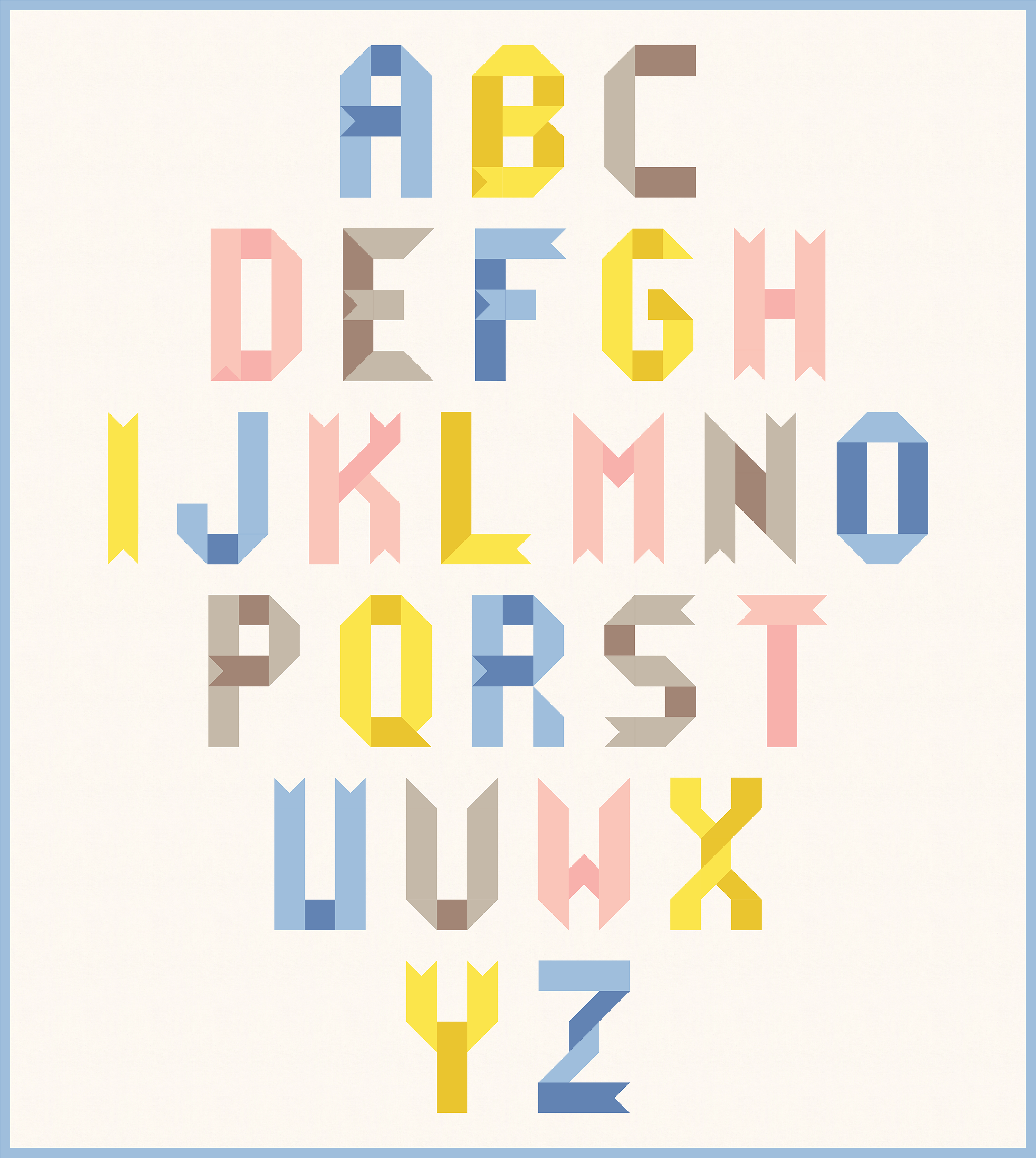
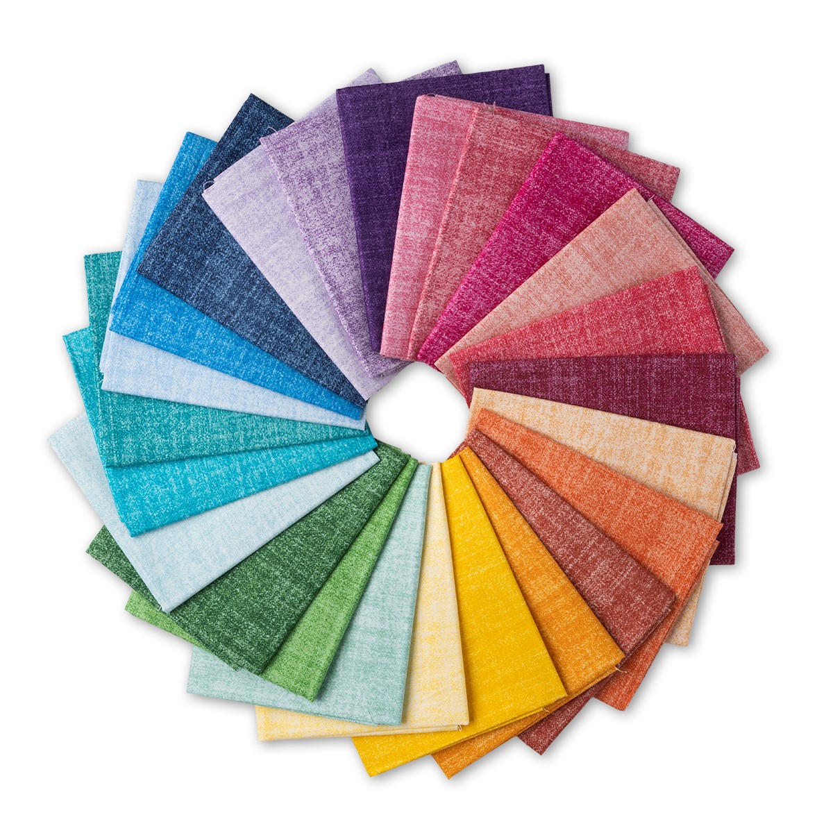 This collection is called the Chambray Tonals Garden Oasis and this is the fat quarter sampler. It jumped out at me because the Ribbon Letters blocks are at their best when you make use of a tone-on-tone fabric combo for each letter. By using a light and a dark in the same color family it creates the illusion of a ribbon folded back and forth on itself to create the letters. Here’s a mockup to give you an idea:
The pattern instructions call for exactly 8 fat quarters (four pairs of each color, again in different tones or weights), and that’s usually what I’ll do. But this bundle has so many fun colours, I’m thinking of expanding to the palette to include more … maybe 10 or 12 fat quarters total … maybe even a rainbow?
Here’s the bundle again.
They also sent me a set of coordinating threads which I think I’m going to have a lot of fun with.
In part two I’ll walk through how I go about choosing the fabrics for each letter block, including my final choices and some layout tips. And in the meantime, here’s those FAQs!
Alphabet Quilt FAQs
Design Questions
Should I use uppercase letters, lowercase, or both?
This depends on your preference and the quilt’s purpose. If you’re creating some kind of message, saying, or personalizing the quilt with a name, you may want to use a combination of both. If you’re creating a classic “A to Z” quilt using the complete alphabet, you may want to use one or the other. For children’s quilts, uppercase might be a good choice because it’s more graphic and apparently these are the letters children learn to recognize first? I kind of like the look of the lowercase quilts I’ve made and seen though, they have a gentleness about them.
What style of lettering would work best (block, script, serif, sans-serif)?
The chunkier or more angled your letter style, the simpler the piecing is bound to be. If you’re paper piecing, Blackletter and Varsity are my favourites in terms of font style that just lends itself to quilting. Script fonts are lovely but are almost always be more fussy, with more pieces to sew etc. In the case of Ribbon Letters, it’s a simple patchwork pattern (no templates or paper piecing required) that relies on basic squares and half-square triangles for its construction.
How large should each letter block be?
If you’re drafting your own pattern, they can be whatever you like! Standard sizes range from 6″×6″ to 12″×12″. Larger blocks will make detailed piecing easier, while smaller blocks allow for a more compact quilt. If you’re adding images or objects alongside letters, you might need larger blocks or need to allow for those extra block in your layout. Remember to account for seam allowances in your measurements.
If you’re using an existing pattern, just check the back of the pattern or the listing description, it should list the block size. For my patterns, the block sizes are as follows:
- Ribbon Letters: each letter block is 5” x 8” (finished)
- Varsity Blocks: letter and number blocks are 5 1/2″ wide by 6 1/2″ high, unfinished. Punctuation blocks are 6 1/2″ high to make alignment with other blocks easy, but vary in width.
- Blackletter:
- alphabet blocks are 9.5″ high and at least 4″ wide (depending on the letter)
- number blocks include two sizes: TALL (corresponding in size to the letter blocks) and SQUARE (5″ x 5″ finished)
- punctuation blocks are 9″ high (finished) and variable width depending on the character
Should I add pictures/objects that start with each letter?
Adding images enhances the educational value of alphabet quilts, especially for children. Options include pieced images (simple geometric designs like houses, stars, or flowers), themed fabric (dinosaur print for “D”), or embroidered motifs. Consider your skill level and the time you have available – adding 26 images significantly increases the project’s complexity.
What’s the best way to connect all the blocks?
Sashing (fabric strips between blocks) helps separate letters visually and makes assembly easier. A width of 1-2″ works well for most alphabet quilts. Alternatively, you can piece blocks directly together for a more condensed look. Consider using a design wall or laying out all blocks before sewing to ensure proper arrangement. Assemble in rows, then join the rows together for the most manageable construction.
Fabric Questions
What fabrics work best for pieced letter quilts?
Cotton is the standard choice for quilting and works well for pieced letters. Choose fabrics with good contrast to make your letters stand out from the background. Though I talked about Ribbon Letters above as being best with tone on tone solids/blenders, they can work great with prints as well, including dots, ditsy florals, or even linear patterns or gradients to enhance the ribbon effect.
Should I use different fabrics/colors for each letter?
Using varied fabrics creates visual interest and can help distinguish between similar letters (like ‘M’ and ‘W’). A cohesive color palette (like primary colors for a child’s quilt or pastels for a baby) creates harmony while still allowing variety. Some quilters use a rainbow progression through the alphabet (like the gradient rainbow I used on my uppercase Blackletter). Alternatively, you might group colors thematically or use fabrics that represent words beginning with each letter (the way I did with my Ruby Star Society Varsity).
What backing and batting would be appropriate?
For backing, choose soft, durable fabric like cotton or flannel. Flannel backing adds warmth and is especially nice for baby quilts. For batting, a low-loft cotton or cotton/polyester blend works well for alphabet quilts that will receive regular use and lots of washing.
Personalization Questions
Should I include special fabrics with meaning (like baby clothes for a baby quilt)?
Incorporating meaningful fabrics adds sentimental value. For baby quilts, consider using outgrown clothes, receiving blankets, or fabric gifted at baby showers. For older children or adults, T-shirt material, favorite clothing items, or fabrics representing hobbies work well. If using stretchy or delicate fabrics, stabilize them with interfacing before cutting and piecing.
How can I make the quilt age-appropriate for the recipient?
For babies, use simple, high-contrast letters and soft fabrics. For toddlers and young children, bright colors and recognizable shapes enhance learning. For older children, consider themes matching their interests. For adults, sophisticated color schemes and more complex piecing techniques create heirloom-quality quilts.
Should I include the recipient’s name or other text?
Personalizing with a name makes the quilt special. You might create an extra row of blocks spelling the name, incorporate it into the border, or add a custom label. Other text possibilities include a birth date, special message, or quotation. Consider your available space and how the additional text will affect the overall design.
Finishing Questions
What’s the best quilting panto style to use for the finished top?
This is a personal choice, but since the letters I use tend to have a chunky/block/angular style, I usually like to use an panto style for edge to edge quilting that’s more curvy. Think loops and swirls. An all-over design as opposed to something linear or geometric.
Here’s a picture of the lovely loops quilted on my first Ribbon Letters by Sarah of Spooled Rotten Quilts.

Next up in part two: narrowing down a palette, and thinking about layout.
This post contains affiliate links, for which I may receive a small commission. I only recommend products I actually use and love.